Work 01  ·  Booth Design · Event Design · Experience Design

2025 Bangkok Jeju Olive Flounder Pop-up Promotion Event

An island’s signature fish introduced to a Bangkok crowd through play, tasting and a photograph worth keeping.

Role
Booth, event and experience design
Type
Pop-up promotion event
Context
Jeju Island seafood promotion, Bangkok, 2025
Scope
Concept, zoning, 3D design, graphics
04
Activity types on the floor
01
Hero product
02
Open sides to the aisle
03
Design disciplines held in-house
01

Objective

This project is a pop-up promotion event designed for Jeju Island to showcase seafood products from the island, with the highlight being the Jeju Olive Flounder.

The hard part is that the hero product is unfamiliar. Olive flounder is a name a Bangkok shopper has no reference for, and a single fish is not a story. The booth had to carry an unknown species, a place most visitors have never been to, and a promotional brief with prizes attached, without collapsing into a fairground stall.

Goal 01
Attach the fish to a place, so the name arrives with an image behind it.
Goal 02
Put a cooked sample in every visitor’s hand, since taste is the only argument that lands.
Goal 03
Let the prize mechanic pull a crowd without becoming the thing people remember.
02

Context

A Thai shopper does not buy an unfamiliar fish. They buy a dish they have already tasted, from a place they can picture.

Korea is known, Jeju is not

Korean food has strong recognition in Bangkok; the island of Jeju has almost none. The brand equity available was national, so the booth had to build the island’s own signals from scratch.

Sampling is the standard

Every food promotion in the hall offers a tasting, so tasting alone does not differentiate. What differs is whether the visitor stays long enough to hear where the food came from.

Prizes attract the wrong crowd

Giveaway booths collect queues of people who want the prize and nothing else. The claw machine was kept small and placed so that it feeds the display, not the exit.

03

Audience

The K-food regular

Already eats Korean weekly and follows it online. Will try anything labelled Korean, and is the visitor most likely to remember a species name if it is given to them clearly.

The weekend family

Comes for the outing. The claw machine and the photo booth are what they came for; the tasting is what they leave with.

The importer or chef

Wants to see the packed product, the cut and the cold chain. Needs a corner of the booth that is not a game.

Journey map · where attention is won and lost
Notice wall
Enter
Claw machine
Tasting
Photo booth
Prize

Design intent, not measured data. Bar length is the share of passing visitors the layout is built to carry to each step.

What each group needs from the booth
K-food regularSpecies name, recipe, where to buy it
Weekend familySomething to do, something to take home
Importer or chefPackaging, grading, supply contact

The three demands are met in three different parts of the plan, which is why the booth is zoned rather than open.

Arrival Engagement Take-away
04

Concept

Jeju, brought to the aisle

The booth is staged as a piece of the island: the volcanic silhouette and the guardian stone figures on the back wall, the seabed at floor level, and the fish itself framed like an exhibit between them. Every activity in the brief was then given a place on that stage rather than a stand of its own.
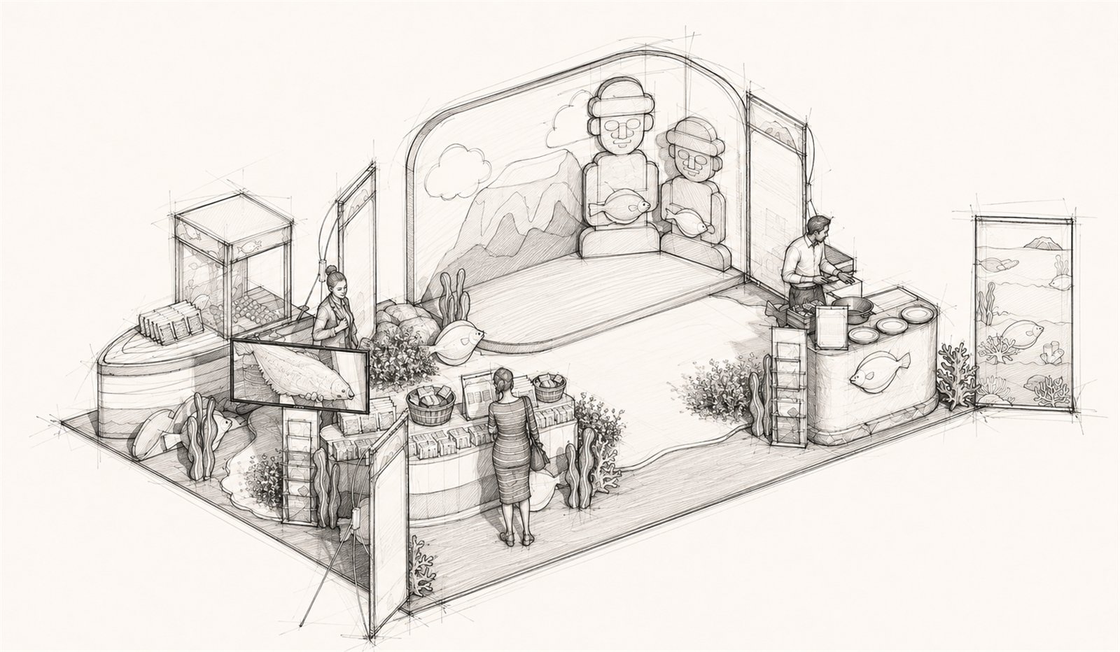
Hand-drawn isometric concept sketch of the Jeju Olive Flounder pop-up
Concept sketch. The stage set out before any material was chosen: guardian figures and volcano on the back wall, seabed running under the counters, framed flounder on a screen at the left, claw cabinet and aquarium panels at the outer edges, and the cooking counter turned to face the aisle.
Part 01
Product display

Packaged seafood on a curved counter, with the olive flounder shown large on a framed panel above it.

Part 02
Food tasting

A live cooking counter on the open side, so the smell of the dish reaches the aisle before the graphics do.

Part 03
Claw machine game

The prize mechanic, kept to one cabinet at the corner where it is visible from two aisles at once.

Part 04
Photo booth

The island wall doubles as the backdrop: visitors photograph themselves in front of Jeju and receive a prize for it.

05

Zoning and circulation

  1. 01
    Island wall on the back edge

    Mountain and guardian-figure graphic held at full height, giving the booth a single recognisable face down the hall.

  2. 02
    Retail counter along the aisle

    Low, curved and continuous, so browsing runs parallel to traffic instead of blocking it.

  3. 03
    Game at the corner

    The claw cabinet takes the outer corner, where its queue forms outside the booth rather than inside it.

  4. 04
    Cooking on the opposite side

    Tasting is separated from the game so smell, heat and waste stay clear of the display and the photographs.

  5. 05
    Centre left empty

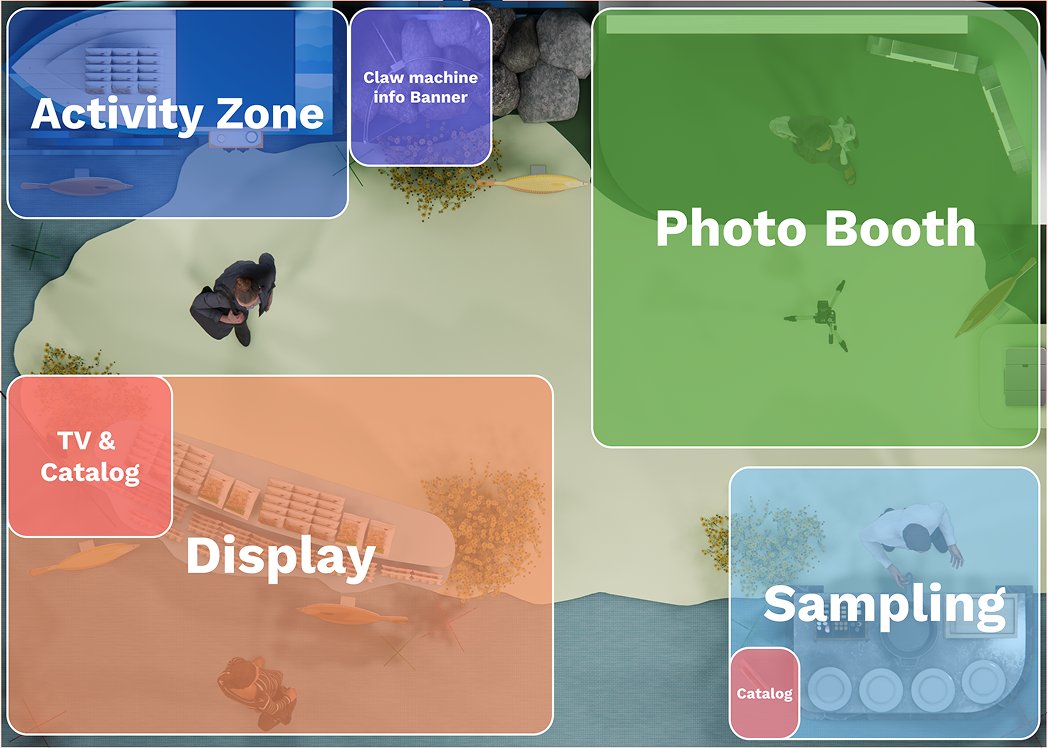
    The middle of the plan is floor, not furniture. It is where the photo is taken and where a crowd can stand without stopping the loop.
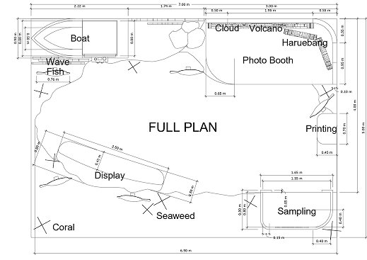
Dimensioned full plan of the Jeju Olive Flounder pop-up event
Dimensioned full plan, 6.90 × 5.59 m. Labels every element that had to fit: boat, display, sampling, photo booth, printing, and the volcano and Haruebang backdrop. Included because it is the drawing that proves the four activities fit without crossing each other.
Zoning diagram overlaid on the plan view of the booth
Zoning study over the plan view. Activity zone and claw machine top left, photo booth taking the whole upper right, display with TV and catalogue lower left, sampling lower right. Included because it shows the decision to keep the centre of the floor empty.
06

The experience, step by step

01
See the island

The wall gives the booth a place before it gives it a product.

02
Play the claw

One free game, no registration, no explanation needed.

03
Browse the counter

Packaged product at hand height between the game and the food.

04
Taste the flounder

Cooked in front of the visitor and served in one step.

05
Photograph and claim

A picture against the island wall, exchanged for a prize.

Before
Recognition at distance

From the aisle the booth reads as a place, not a promotion. The mountain silhouette and the two stone figures do that work in one glance, before any text is read.

During
Game, product, food, in that order

The sequence is deliberate. The game costs nothing and gives permission to stay; the counter is passed on the way to the food, so the packaging is seen before it is offered.

After
The photograph leaves with them

The prize is claimed at the photo booth rather than the exit, so the last thing a visitor does in the booth is put Jeju in their own camera roll.

07

Design

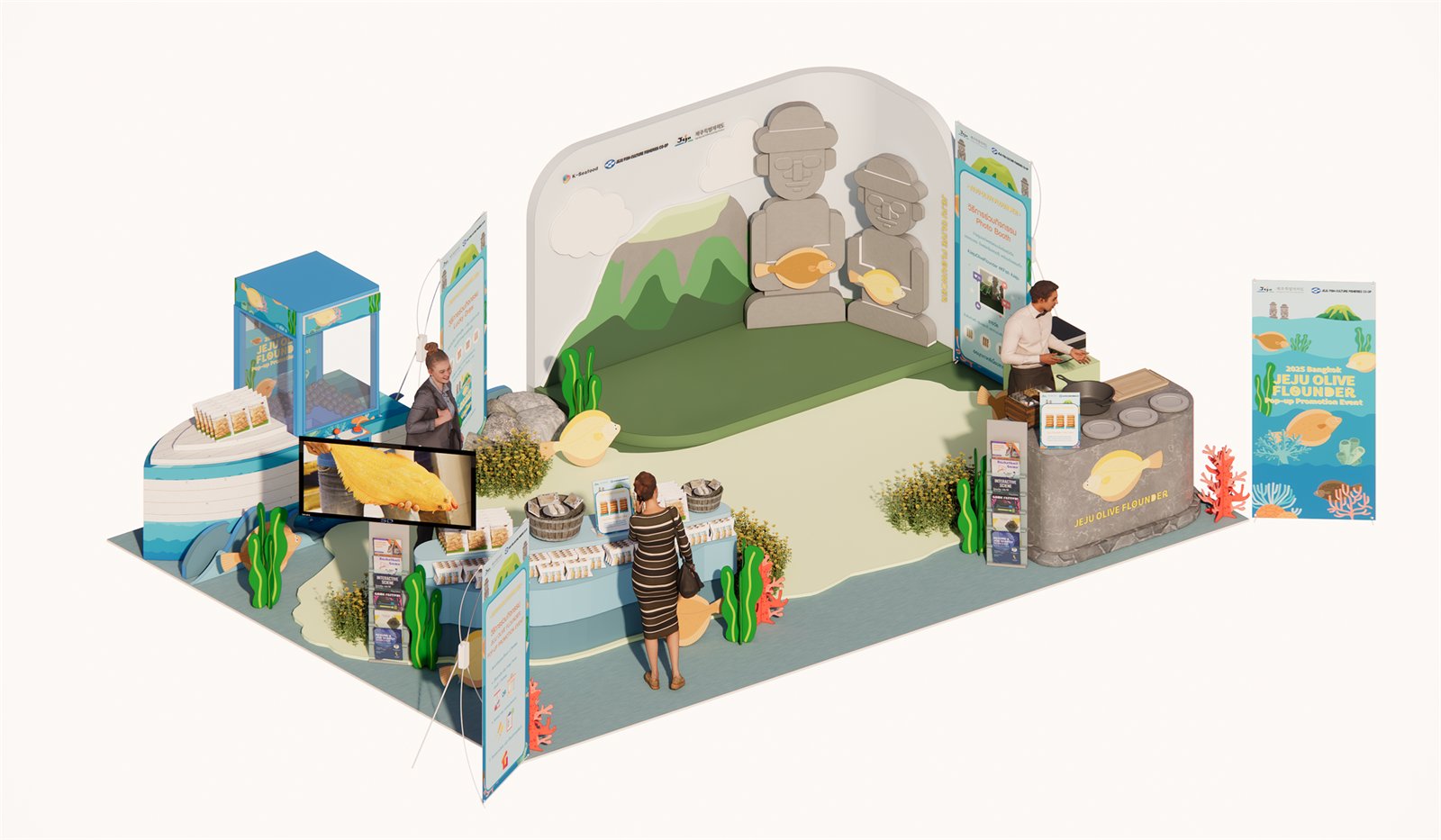
Isometric 3D render of the built Jeju Olive Flounder pop-up event
The governing view. It carries the two decisions the project rests on: the island wall used as both identity and photo backdrop, and the ring of low curved counters that lets four activities happen at once without any of them queueing into another.
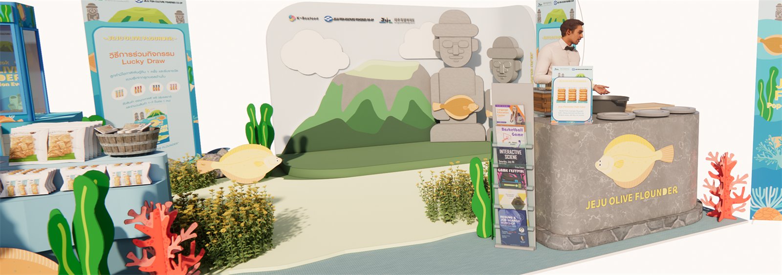
Wide front view render of the booth
Front view, full bleed. Reading left to right: product counter, seabed floor, island wall, catalogue stand and the stone-clad cooking counter. Shows the height hierarchy that makes the booth legible from the aisle.
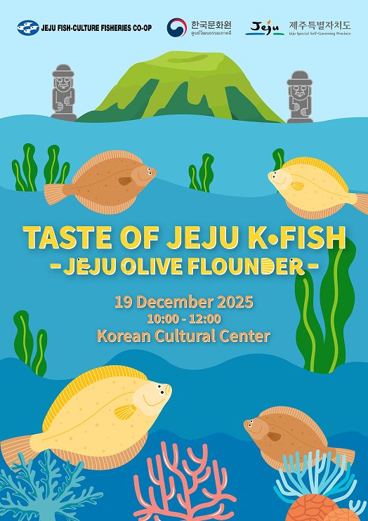
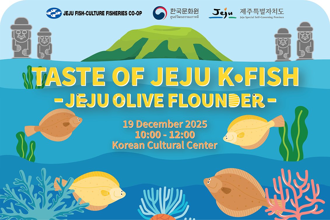
Key visual poster for Taste of Jeju K-Fish
Key visual, poster format. Sets the whole graphic language, flat vector sea, Hallasan, guardian stones and the flounder as the only detailed object.
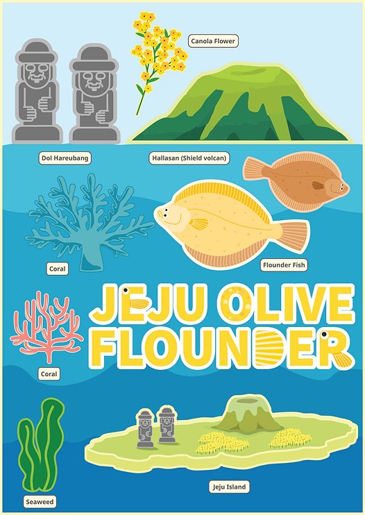
Labelled sheet of the booth graphic elements
Element sheet. Every motif named and drawn once, Dol Hareubang, Hallasan, canola flower, coral, seaweed, flounder, so the same parts could be reused across wall, counter and print.
Horizontal key visual used as the event backdrop
Backdrop version of the key visual. The same artwork re-laid for a wide screen, with the title held above the waterline so it survives being stood in front of.
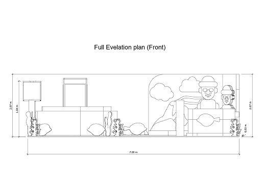
Front elevation of the booth with dimensions
Front elevation, 7.00 m wide. Fixes sign height at 2.09 m and the island wall at 2.27 m, the numbers that decide whether the booth reads down the hall.
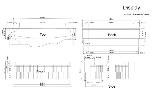
Production drawing of the display counter
Display counter, plywood and wood. Top, front, back and side in one sheet so the wave-cut edge could be cut without interpretation.
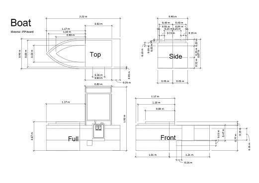
Production drawing of the boat display unit
Boat unit, PP-board. The claw machine plinth drawn as a fishing boat, four views, because nothing on it is a right angle.
Visitors at the product display counter during the event
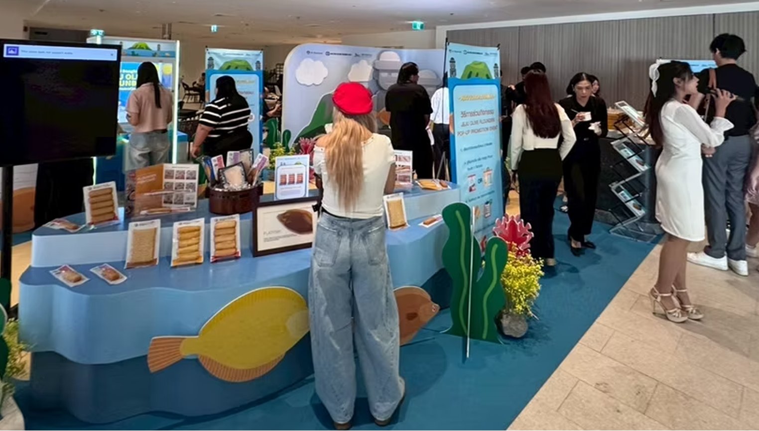
Built, on the day. The wave-cut counter with the flounder graphic on its face, product laid out at hand height, and the aisle edge left open, the test of whether a passer-by will stop without being asked.
Group being photographed at the booth photo point
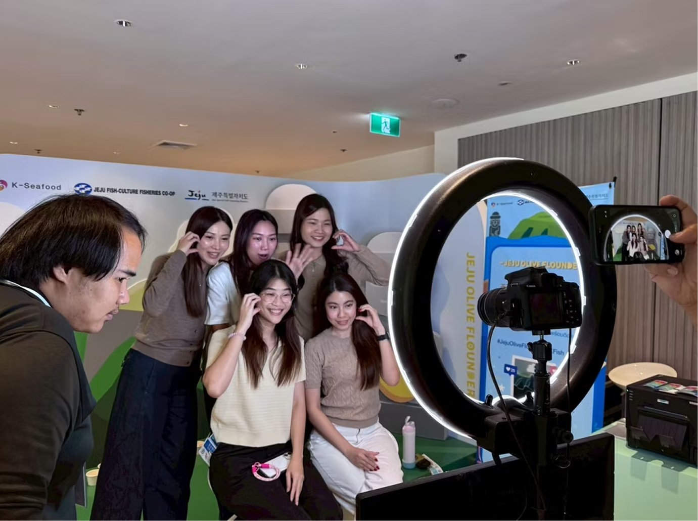
The photo point in use. Ring light, camera and instant printer against the island wall: the activity that produced the event's own social content.
Press filming at the product display during the event
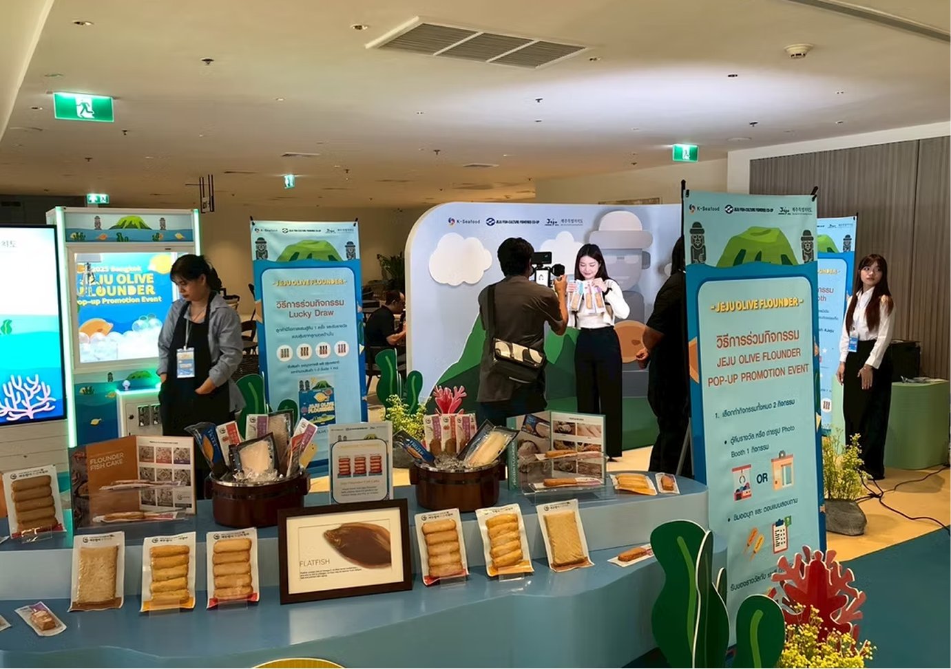
Press at the display counter. The packaged range, the framed flatfish print and the activity banner all fall inside one camera frame, which is what the layout was for.
Host presenting on the event floor
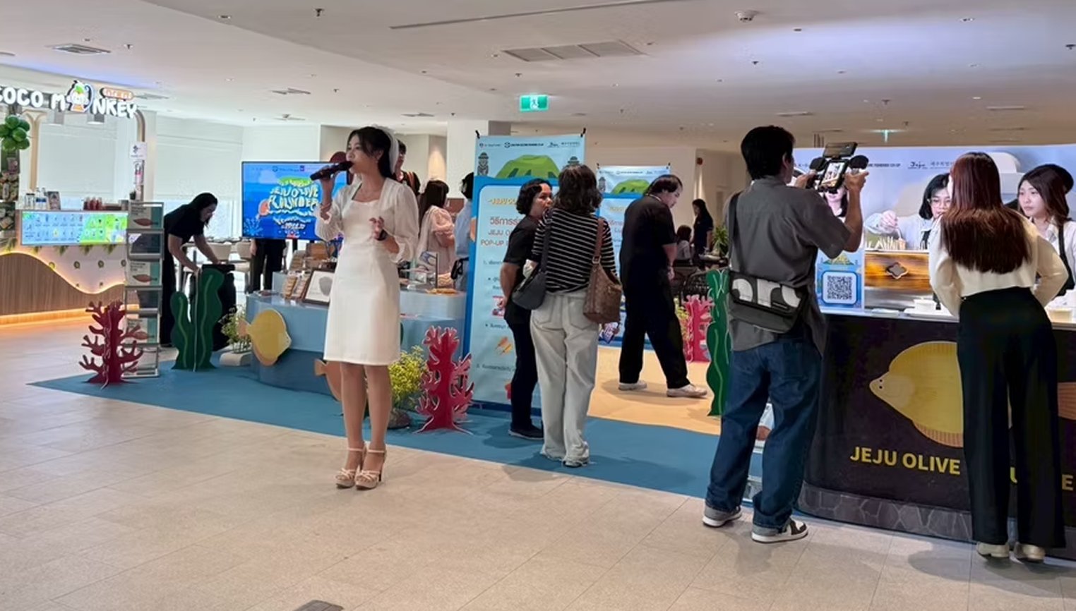
The floor during the programme. The empty centre of the plan absorbs an audience without any part of the booth being closed off.
08

Outcome and reflection

Place first, product second

Leading with the island rather than the fish gave visitors somewhere to put the new name. The species became a detail of a story they could already picture.

One backdrop, two jobs

Making the identity wall the photo backdrop meant every visitor photograph carried the branding, without a single extra structure being built for it.

What I would do differently

The claw machine attracted more attention than the tasting and pulled some visitors straight past the product. I would move the game deeper into the plan and put the cooking counter on the corner, so the first thing that stops people is the food.

← All projects